A brand people know before they read the name.
We design your logo, colors, type and templates as one system, in Arabic and English, so every post, sign and page looks like the same serious company.
Without an identity, your business looks different every time someone sees it.
- 01
Every post looks like a new company
A different font, color and logo size each time. Customers can’t tell your posts from anyone else’s.
- 02
You look smaller than you are
A logo from a free app tells a buyer you cut corners, before they see a single piece of your work.
- 03
Nobody remembers you
People recognize shapes and colors long before they read a name. With no fixed ones, there is nothing to remember.
What you receive
Logo system
A primary logo plus horizontal, symbol and social-icon versions, in color, black, white and reversed.
Color palette
Main and supporting colors with exact codes for screen and print.
Typography
Headline and text fonts for Latin and Arabic, chosen to work together.
Brand guide
A PDF that shows your team and your printer how to use everything.
Ready templates
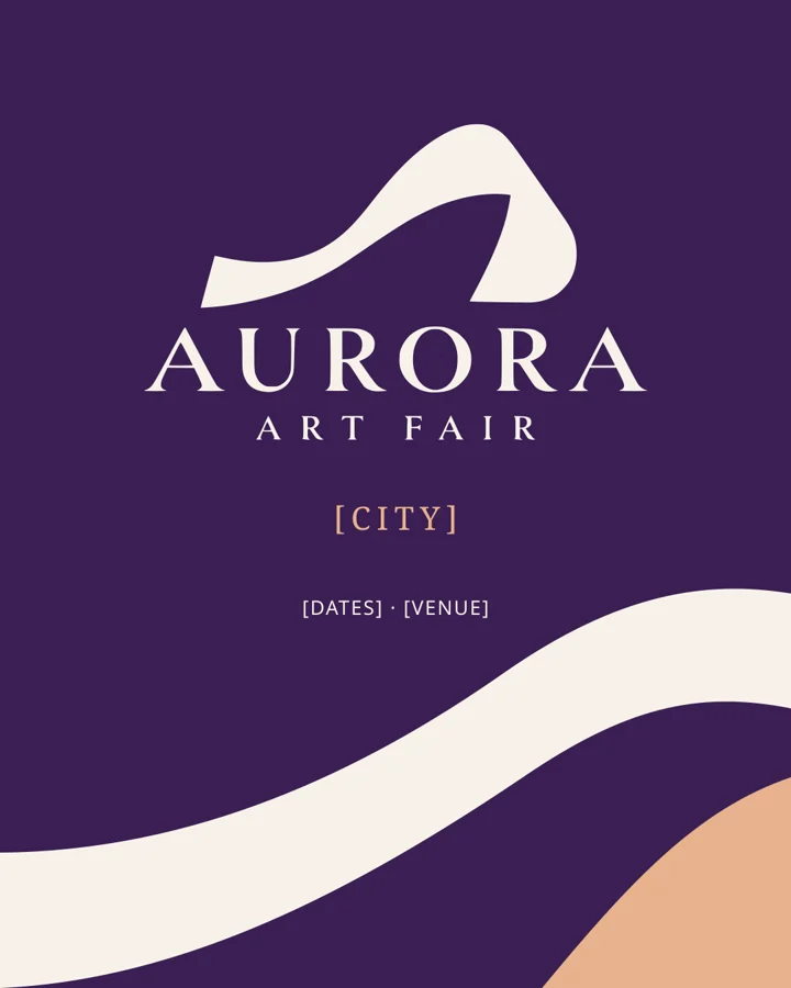
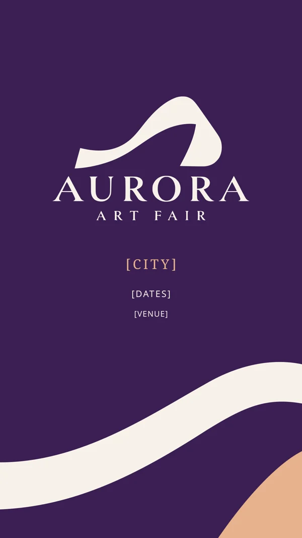
Instagram posts and stories, letterhead, catalog cover and passes, all editable.
Digital kit
Favicons, app icons and profile pictures at every size the platforms ask for.
Aurora is an international art fair. We gave it one identity that travels from city to city. Its line: Trace of light.
- The challenge
- Aurora had no visual identity, and its website did not match the level of the artists it shows. Every edition looked as if someone else had organized it.
- What we made
- A symbol drawn as a single trail of light, a serif wordmark, and a palette of deep purple, ivory and apricot. A city line under the logo changes for each edition, so the fair keeps one face in every country. Then the full kit: guide, templates, digital icons and print files.
- What comes next
- Aurora’s website, videos and the rest of its digital presence, all built on this identity.
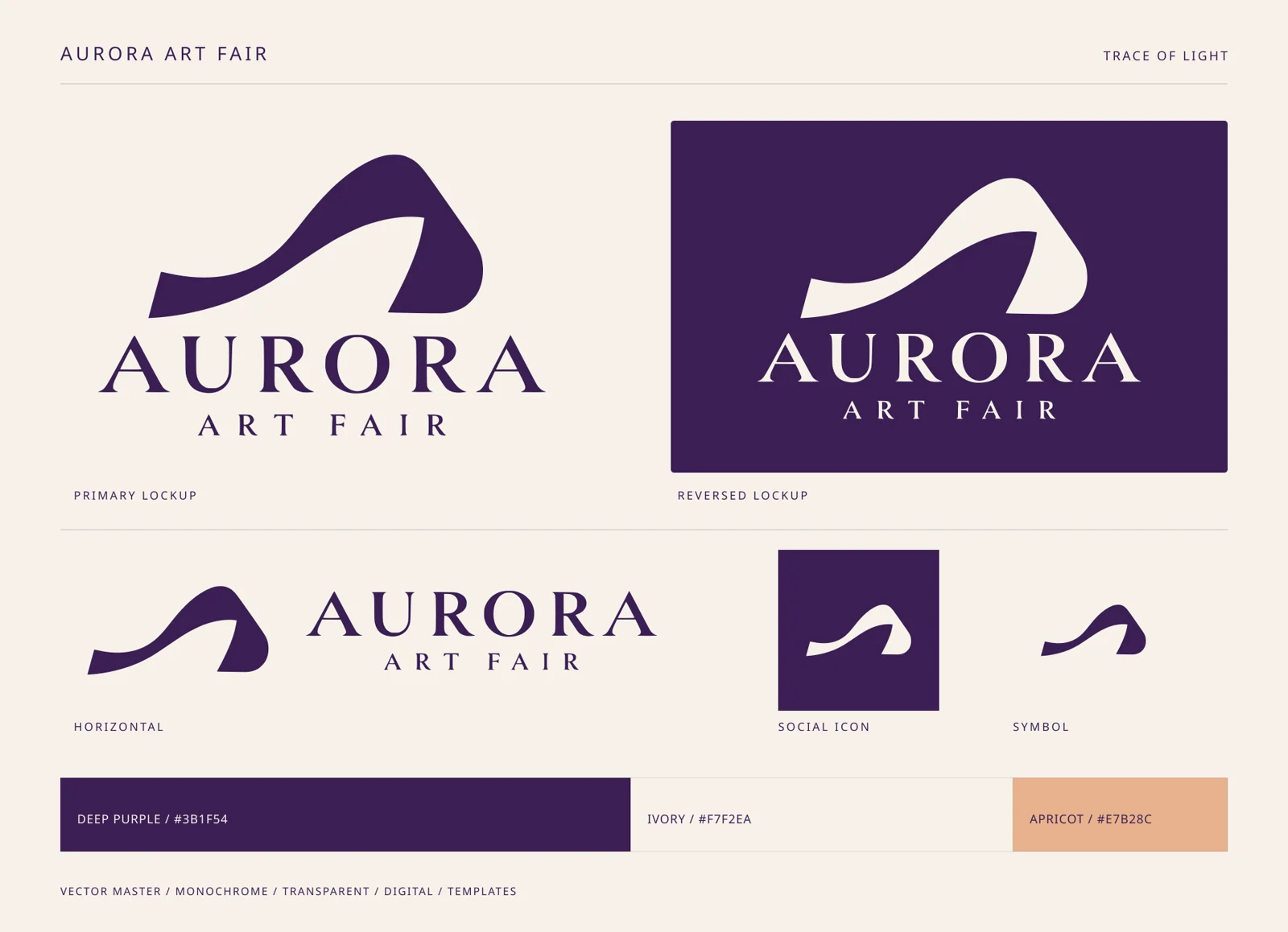
- Deep purple#3B1F54
- Ivory#F7F2EA
- Apricot#E7B28C
Our identity fits the spirit of the art fair perfectly, as if the team understood the art before designing.
How we build it
- 01
Listen
We learn your business, your customers and the competitors you need to stand apart from.
- 02
3 to 5 directions
Between 3 and 5 different concepts in black and white, on day one, so you judge the shape before the color.
- 03
Refine and color
We develop the one you choose, then add color and type.
- 04
Deliver the kit
Every file, the guide and the templates, ready two days after you choose.
Arabic and English, designed together
Most logos are drawn in one language, and the other is typed in afterwards. We design both versions side by side, with matching weight and height, so your brand reads as one in Baghdad and abroad.
Before you start
Ready for a brand people remember?
Tell us about your business on WhatsApp. We reply with the questions that shape your identity.